
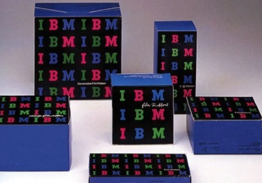
Images from the works behind originalwerk (Home-style café made by WERK), designed by Service Center. Inspired by package portfolios from the legends of industrial design in the 50s & 60s. Adopted unique compositions and colors from IBM, Knoll package portfolio’s designed by Paul Rand and Massimo Vignelli and Swiss pharmaceutical companies’ product images.
Transparency is the main theme of originalwerk’s packaging boxes. The boxes were designed for customers to be able to tell the quantity of the items inside, inspired by the extraordinary work ‘Measurements’ by Mel Bochner. ‘Measurements’ is one of the representative artworks that uses a mathematical concept where each line’s lengths and placements are measured and recorded exactly.
서비스센터에서 디자인한 오리지널베르크(베르크가 홈카페 시장을 겨냥한 브랜드)의 결과물들을 촬영한 이미지 컷들. 1950-60년대 산업디자인 최전선에서 레전드 디자이너들의 패키지 포트폴리오 이미지들을 많이 참고했고, Paul Rand, Massimo Vignelli가 디자인한 IBM, Knoll 패키지 포트폴리오, 스위스 제약회사들의 제품 이미지들에서 보이는 특유의 구도와 색감을 의도적으로 담았습니다.
오리지널베르크 박스 패키지의 경우, 안에 들어있는 제품의 개수를 직관적으로 알 수 있도록 의도해 디자인했는데, 아티스트 Mel Bochner의 Measurements 작업에서 영감을 받았습니다. 이 작업은 각 측량선의 길이와 위치가 정확하게 기록되어 있고 미술에서 수학적 개념을 적용한 대표적 작품 중 하나입니다.
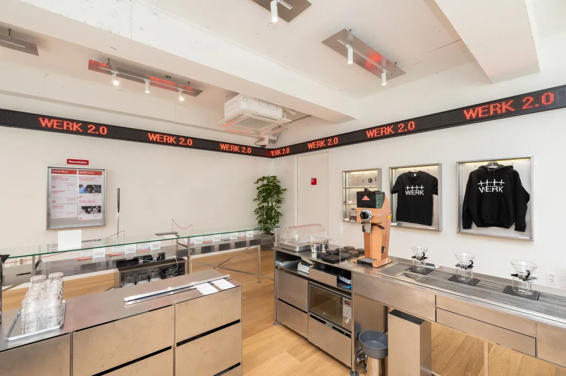
WERK which made its debut as a coffee roastery in Busan, South Korea back in 2018, has grown successfully in Korea’s specialty coffee market over the last 4 years. And last year, Service Center and WERK met again to collaborate on project 2.0. We devoted our time to reorganize the entire brand’s application, experiences and designs of the shops, and vision and goals of the company.
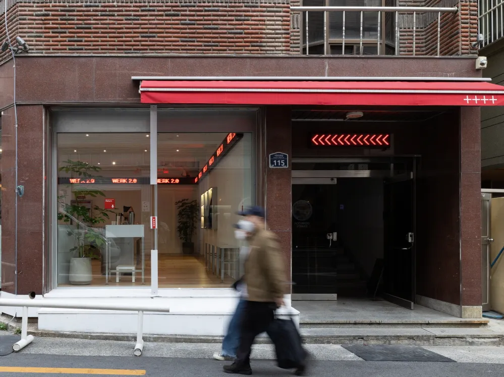
베르크는 한국 부산에서 커피 로스터리로 2018 년 처음으로 선을 보이며, 이후 4년간 폭발적으로 한국의 스페셜티 시장에서 성장을 이뤄냈다. 그리고 작년, 다음 도약을 위해 서비스센터와 베르크는 다시 만나 2.0 프로젝트를 함께 진행했다. 브랜드 전체 어플리케이션, 오프라인 매장 디자인 및 경험뿐만 아니라 기업의 비전, 목표까지 재정비했다.
“Service Center has thought about when a brand dies: a brand loses its life when its own color becomes so dull. When a brand is born, like a new kid on the block, consumers find it interesting enough to take a look even when it’s not well-presented just yet. When the brand becomes bigger and more well-known, it strives for a new direction and asks other brands for collaboration. Collaboration is something a brand should be careful of, though, as too many collaborations can make the brand lose its color. Then, suddenly the brand can die. On the other side, there are brands that are able to accentuate their own colors while sustaining their originality. This is what WERK considers important. WERK should present the more mature yet original version of itself. And this is the biggest goal Project 2.0 is trying to achieve. We utillized WERK’s signature red color, which is very crude and industrial at the same time. In an industrial nuance, the color red gives a sense of productivity and abundance. WERK carries excellent quality coffee, and we wanted the brand to have more exposure by creaUng designs so familiar and honest.”- December 16th, 2021, An audio recording from a meeting w/WERK delivered by director, Hyeok-Jun Ko.
“언젠가 서비스센터는 브랜드는 언제 죽는지에 대해 고민한 적이 있습니다. 브랜드가 가진 색깔이 되게 지루해진다는 느낌이 들 때 빠른 속도로 브랜드는 생명력을 잃어버립니다. 브랜드가 태어날 때는 말 그대로 뉴키드 온더 블락, 동네에 갑자기 나타나 소비자들은 뭔가 완벽하지 않지만, 매력을 느끼고 충분히 구매해볼 만한 가치가 있다고 인정합니다. 점차 브랜드를 아는 사람들이 많아질수록 어떻게 확장할지 고민을 하게 되고, 다른 브랜드들과 콜라보를 하게 됩니다. 하지만 콜라보가 많아지면 많아지는, 이 과정에서 지루해지는경우들이 생길 수 있습니다. 이렇게 그냥 그저 그런 브랜드로 죽는 경우들이 많습니다. 반대로 본인들이 하는 비즈니스의 본질로 돌아가 성숙하게 해내는 팀들은 여전히 멋이 있다는 걸 증명해낸다. 베르크는 바로 이 문장에 집중할 필요가 있다고 느꼈습니다. 베르크가 성숙해진 모습을 소비자들에게 보여주는 것을 목표로 삼아야 합니다. 이번 ‘2.0’ 프로젝트에서 우리에게 아주 중요한 도전 과제입니다. 그리고 우리는 베르크의 상징이 된 컬러, ‘빨간색’을 더 잘 쓰면 좋겠다고 생각했습니다. 빨간색은 가장 원초적인 색이기도 하지만, 가장 공업적인 컬러 중 하나입니다. 생산성이 아주 높다는 뜻인데, 다 말하면 결국 많은 사람에게 보급하기 좋은 색이라는 뜻입니다. 베르크가 좋은 퀄리티의 커피를 다루지만, 결과적으로 모두에게 필요한 수준의 양만큼 전달할 수 있는 디자인으로 만드는 것을 역시 베르크 2.0 의 큰 목표로 삼았습니다.“—2021년 12월 16일 베르크 미팅 녹취 기록, 고혁준 디렉터의 프레젠테이션 中
We took a look at New York’s ‘Supreme’ store for research purposes for our WERK 2.0 project. Supreme has seemed to lose its popularity with new brands like Aime Leon Dore and Noah emerging in the market. Nonetheless, Supreme is still unique and staying strong. While it gives off the image of backstreets and mischievousness, the brand itself is surprisingly very mature. Even the store interior is so classic with wooden floors with white walls. And yet, it did not forget what is most important: skateboards. Those skateboards are like coffee to WERK.
WERK is improving, and its slogan “WERK(Work) in Progress” and arrow symbol embody its progress. The arrow symbolizes WERK’s constant challenges towards the beker.
베르크 2.0 프로젝트를 위해 리서치하며 뉴욕의 슈프림을 다시 들여다봤다. 노아, 에임레온도르의 등장 이후 매장을 가보면 다소 인기가 식은 느낌이지만, 여전히 매력적이고 건실하다. 뒷골목, 악동을 상징하는 브랜드인데 잘 보면 성숙하다. 매장도 클래식 그 자체다. 마룻바닥에 흰 벽이 끝이다. 하지만 가장 중요한 것은 놓치지 않았다. ‘스케이드 보드’. 베르크에게는 가장 중요한 것, 바로 ‘커피’다.
베르크는 더 나아졌다. 그리고 계속 발전하겠다는 행동, 여전히 진행 중이라는 의미로 WERK(Work) in Progress 라는 문장과 화살표를 만들었다. 화살표 심볼에는 베르크의 도전 정신이 담겨있다.
A piece from 'Project 2.0' portfolio that was presented in 2021 Winter. Service Center suggested WERK mature up its brand image without skewing from its originality, and it has proven itself its potenciall since it revealed 'Project 2.0' in January 2022. Revealed images inside the presentations show street brands that have lasted tilll now, a mood board that directs the project from 1.0 to 2.0.
베르크 2.0 프로젝트를 위해 21 년 겨울, 베르크에게 제안한 프레젠테이션 일부. 서비스센터는 베르크가 비즈니스의 본질로 돌아가 성숙해진 모습을 소비자들에게 보여주는 것을 목표로 삼자고 제안했고, 2.0 을 선보인 22 년도 1 월부터 오늘에 이르기까지 다시 멋있는 브랜드라는 것을 증명해냈다. 프레젠테이션에는 많은 내용이 있었지만, 공개한 이미지들의 내용은 생존한 스트릿 브랜드들, 1.0 에서 2.0 으로 가야 할 방향과 무드보드.
